
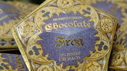
For example, the packaging of the various candies and chocolates on the train to Hogwarts are always fun to look at, like the chocolate frog!

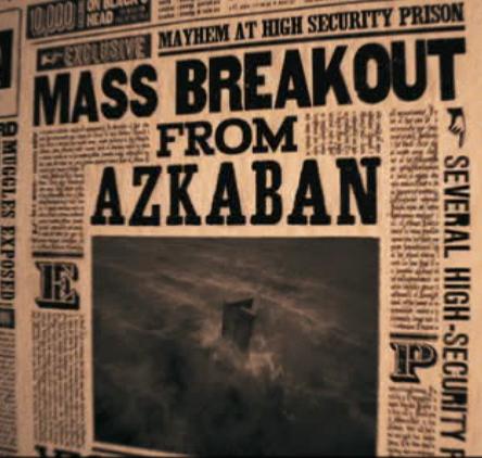
But, what really caught my attention in the new Harry Potter was the portions of the film that show off the "Daily Prophet," which is the newspaper in Harry Potter land. It is cool that the photos in the newspaper move, however I think what is even more beautiful about it is the typography. Whoever designed the various papers in the movie series must have gone through a hard time trying to stack and track out all of the headers and text. The paper has interesting drop caps and hierarchic shifts. Especially in the new movie I noticed that the designers used "rivers" and "gaps" in the text of the paper to make imagery, like swirlies and things.
I'm impressed with the production of Harry Potter and the detail and creativity that went into making the "Daily Prophet." It was definitely not an after thought in the movie. Here is a link to part of one Harry Potter film. At 34 seconds it shows the actual newspaper [if you want to skip ahead]. Here are some images of the paper too. It may break some type rules, but.. it's Harry Potter after all.


No comments:
Post a Comment