
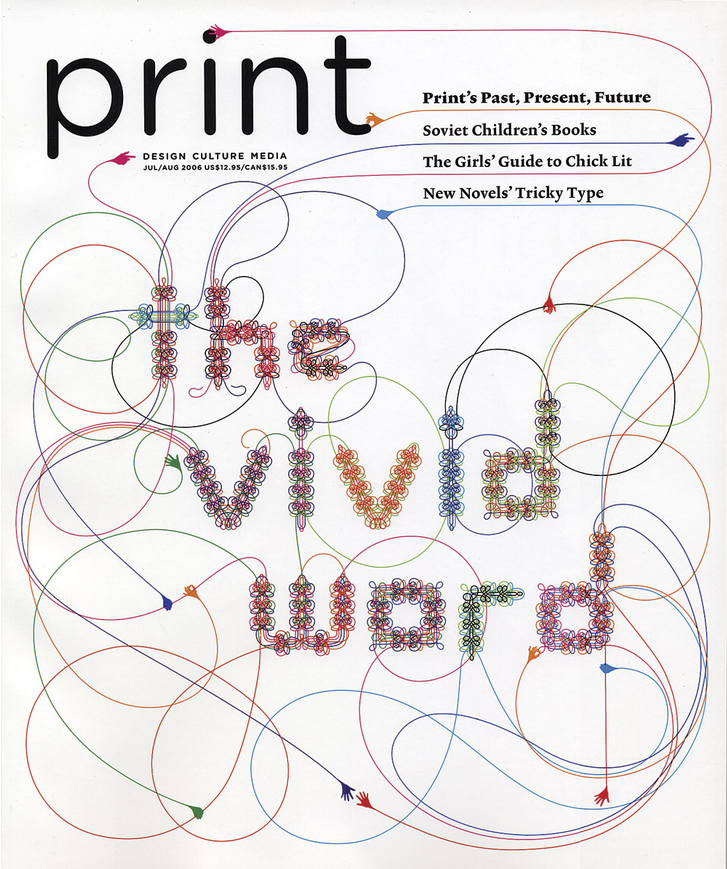
Contemporary Women Type Designers
Veronika Burian

Veronika Burian is the co-founder of TypeTogether, a type foundry in the Czech Republic that began in 2006. Although she studied industrial design as an undergraduate, her friend introduced her to type design, an experience she described as “like falling in love.” Despite her move away from product design, she’s noted the similarity between the two fields, as both typography and products are designed “to improve the experience of an object from the user’s point of view, be it a good piece of typography or a comfortable chair.” Today, she works fulltime in Spain on TypeTogether.
TypeTogether is known for their display typefaces intended for editorial use, while maintaining a sense of personality and a refined technical standing.
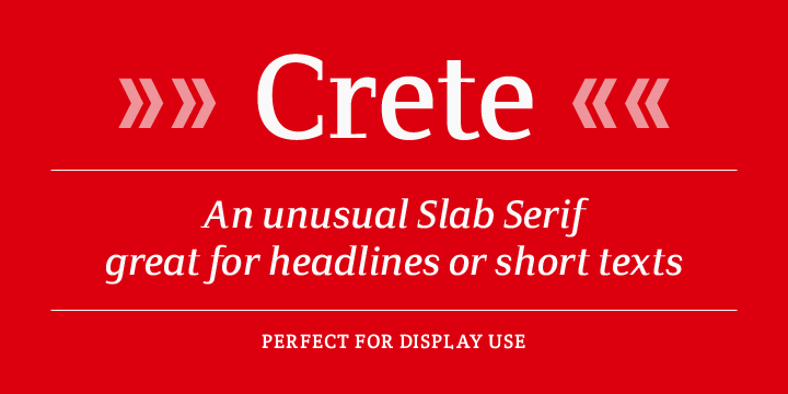
For instance, Crete is a typeface Burian designed after being inspired by a chapel wall’s lettering in, you guessed it, Crete. Notable are Crete’s serifs, which vary between being slab-like or curved upwards. Depending on the weight, the serifs add a touch of sophistication in Thin or strength in Thick. Crete is an interesting display type, and exemplifies TypeTogether’s reputation for creating unique typefaces that still function well.
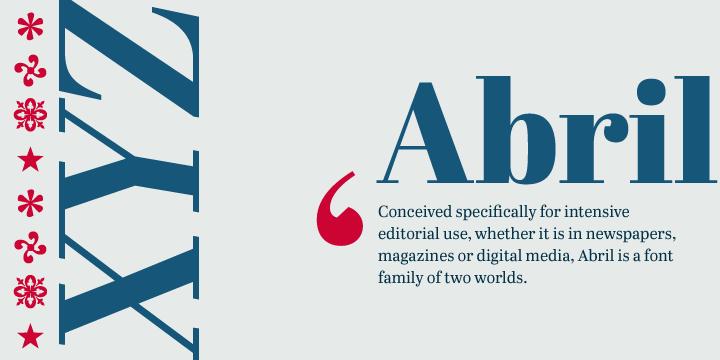
Another notable typeface is Abril. If purchased all at once, Abril comes with an array of different weights that make the typeface multilingual in function. Like TypeTogether’s other typefaces, Abril is intended for use in publications, in print and online. The contrast between thicks and thins make Abril fun and compelling to look at. Similarly, the curves of the italic typefaces offer a contemporary take on a 19th century slab serifs. Burian and her partner have won several awards for Abril.
Marian Bantjes
Marian Bantje’s work straddles the line between design and fine art. Based on a small island off the coast of Canada, Bantjes is an established and respected graphic artist who has spoken at conferences worldwide. Her projects span across patterning, illustration, photography, typography, and design. For the purposes of this blog, however, I will focus on some of her type design work.
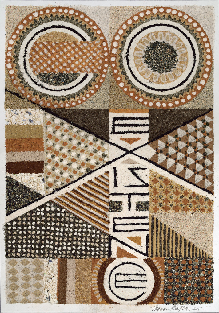
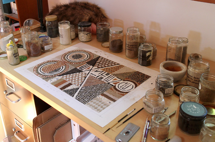
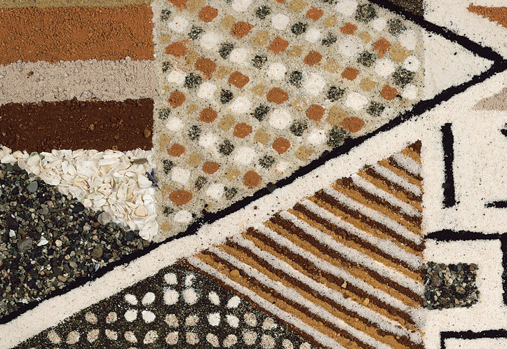
Bantjes’s Coexistence Poster was created for Alliance Graphique International (AIG) for an annual poster call. Bantjes designed the poster using her collection of sand, which she gathered from around the world during her travels. The poster exemplifies Bantjes’s eye for detail, pattern, and texture in addition to type. It reminds me of the current trend of using unconventional objects or materials and photography to create type, which Bantjes has explored in a number of projects herself.


Bantjes also makes great use of intricate line work in her typography. She’s internationally recognized for her ornate designs, and almost a bit obsessive exactness. Something I admire about her typography work is how apparent and significant her design choices/rationale are. Every corner of each letter appears intentional and thought-out.
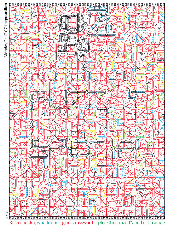
Her cover for G2 in 2007 is a complex pattern that she designed to create the letterforms. If you can make it out, it says, “Puzzle Special.” Pretty amazing. And cool. Usually I stray away from work that’s too complex and confusing, but Bantjes’s work is different. In a time where popular design is flat, simplistic, minimal, and to the point, the eye candy that is Bantjes’s work becomes refreshing and unique. It holds my attention and only gets more compelling the longer I look at it. I’m not sure how many contemporary designers pull that off.
Zuzana Licko
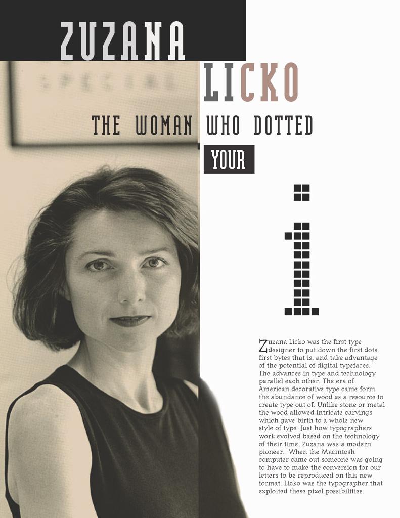
Zuzana Licko is a typeface designer based in the Bay Area who is known for her early work designing bitmap type as Macintosh Computers first arrived on the scene. She and her husband co-founded Emigre, a type journal, in the mid-1980s. Licko designed an array of bitmap fonts for use in their magazine. Émigré became known for its experimental and unconventional use of type’s scale, leading, and column widths. Graphic designer Massimo Vignelli condemned Émigré’s aesthetic, calling it “garbage.” Eventually, however, Licko’s eccentric and unique style was accepted and praised over time. Today, Emigre exists as a typefoundry. Licko’s most well-known typeface, Mrs. Eaves, can be bought from Émigré’s website.
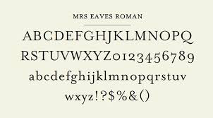
Mrs. Eaves, a remix of sorts of Baskerville, is named after Baskerville’s wife, Sarah Eaves. In her own words, Licko describes designing of Mrs. Eaves as “want[ing] to reinterpret Baskerville in a warmer manner, with less contrast, so it would be more fluid.” Indeed, reading text in Mrs. Eaves has a soothing quality to it. Its easygoingness is a significant difference from Baskerville, a typeface designed with high contrast in mind.
When the Macintosh Computer first arrived on the scene, traditional typeface designers shied away from it, calling it a “cute novelty” (Eye Magazine, 2002). However, Licko took to using the Mac as a type design tool immediately, describing it as like falling in love. Thus, Licko is remembered for being one of the first designers to see the potential in the pixel and embrace digital techniques. In fact, Licko works nearly exclusively on the computer. Aside from a few thumbnail sketches to figure out shapes of letters, Licko designs her typefaces using font software (Fontographer) and makes adjustments optically.
The influence of the aesthetics of the early computer is evident in Licko’s work. For example, her typeface Citizen is recognizable by its sharp edges and bitmapped appearance.
Citizen is merely one typeface that represents the dozens of unique typefaces in which Licko harkens back to primitive digital technology.

Typeface: Lo-Res
Typeface: Citizen
Typeface: Senator
Bibliography
Burian
Bantjes
- http://bantjes.com/work/category/portfolio/
Licko
- http://www.eyemagazine.com/feature/article/reputations-zuzana-licko
- http://www.emigre.com/Licko6.php
- http://www.aiga.org/medalist-zuzanalickoandrudyvanderlans
Extra Resources
http://womenofgraphicdesign.org/
http://www.alphabettes.org/
http://typequality.com/
No comments:
Post a Comment